A practical example
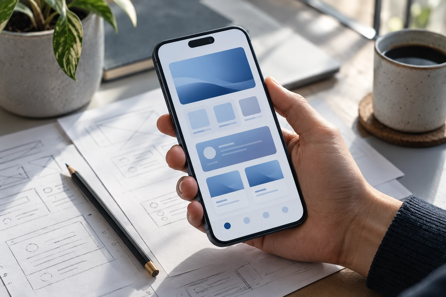
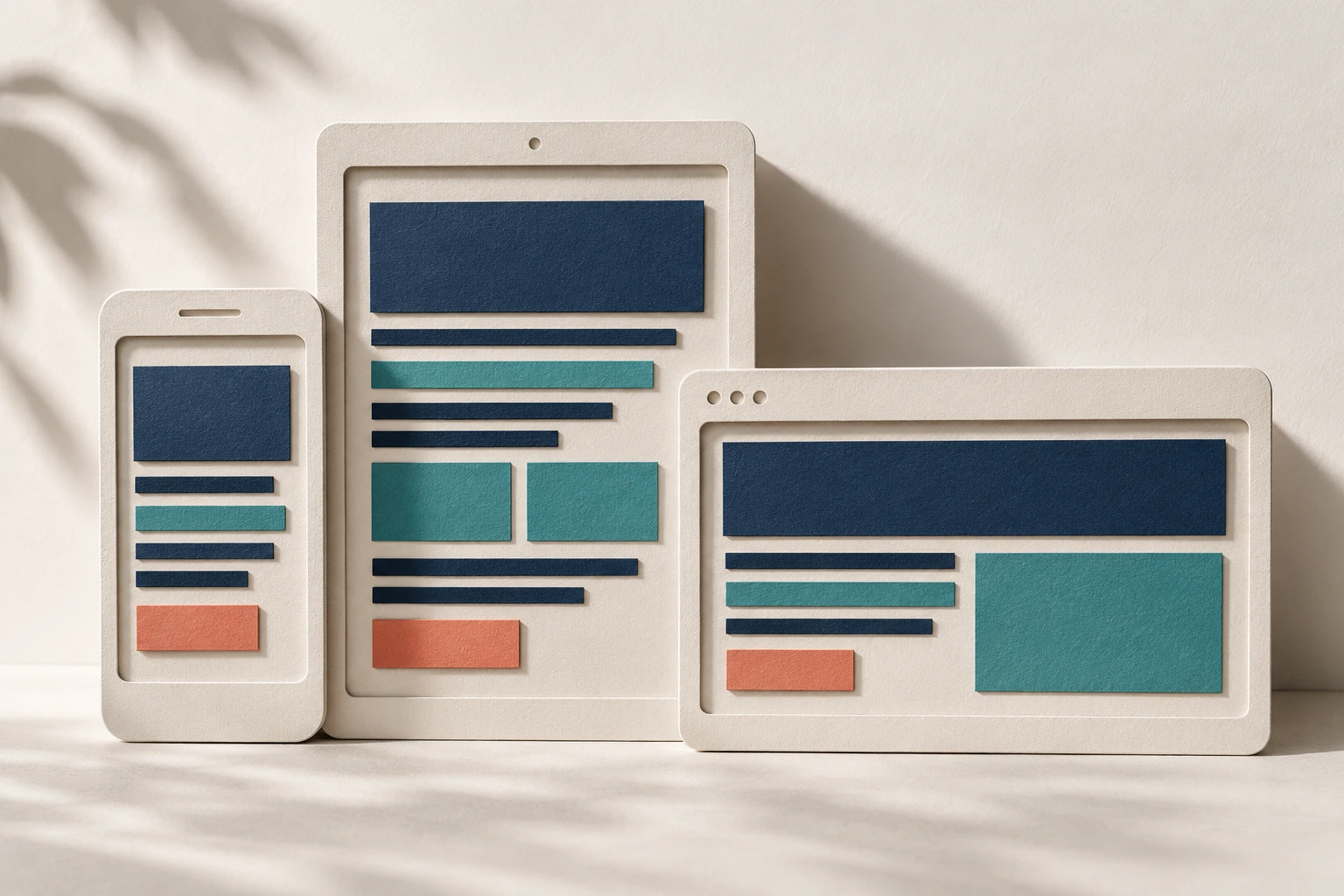
For a mobile ordering screen, show the product, quantity, price and next action clearly before secondary information. Make errors understandable and preserve entered values when possible. Test with a realistic product list and a small viewport. A desktop page squeezed onto a phone is not the same as a journey designed for mobile use.
A mobile-first review

| Focus | Practical approach | Check before proceeding |
|---|---|---|
| Content | Put the essential task and information first. | Avoid hiding critical information only because the screen is small. |
| Controls | Use readable text and easy-to-select controls. | Test keyboard access, focus and form errors too. |
| Performance | Load the assets required for the current view. | Check ordinary devices and constrained connections. |
Does mobile-first mean removing important information?
No. It means prioritising and presenting information appropriately. Critical details must remain available and understandable across screen sizes.
Useful next steps
For a related perspective, read Mobile Apps and 5G: Design for Real Network Conditions, Why UI and UX Matter in Business Software, jQuery in Existing Websites: Maintain, Replace or Migrate?.
If you need help applying this to your business, explore our website design and development or discuss your project.
Sources and further reading
By Tech Me Today. Originally published October 6, 2023. Expanded on .
Explore all articles →